When you have limited screen real estate design becomes very important. Putting in a lot of data without making the screen cluttered in very important when designing applications. This takes a lot of thinking and fortunately the engineers and ui experts at apple have done this thinking for you. They have provided easy to use design patterns in their sdk for making good, presentable and usable apps.
Some of these deign patterns are


Some of these deign patterns are
- Tab Bar
- navigation bar
- table views
- toolbars
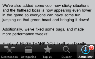
Tab Bar
This design pattern presents a bar at the bottom of the screen with 3-5 icons on it which present different views.
Navigation bar
This patterns presents a hierarchy of views, which are related providing mechanisms to move back and forth in the heirarchy.
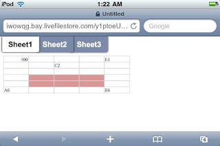
Table View
This view presents a scrollable list of items with each item very often presenting a view of its own. It is extremely effective in presenting a lot of data in limited screen size.
Tool bar
This was introduced in iOS 3.0 (it was called iPhone OS back then), its position is same as the tab bar, i.e at the bottom of the screen. You can see it in safari, mail and a lot of other applicaitons

Personal opinion, I believe putting a toolbar on top of a tab bar is a horrible idea.
For further reading you can refer to apple's iOS Human Interface Guidelines ,
also pttrns is a great site which assembles the best UIs in the AppStore for your reference http://pttrns.com/
No comments:
Post a Comment